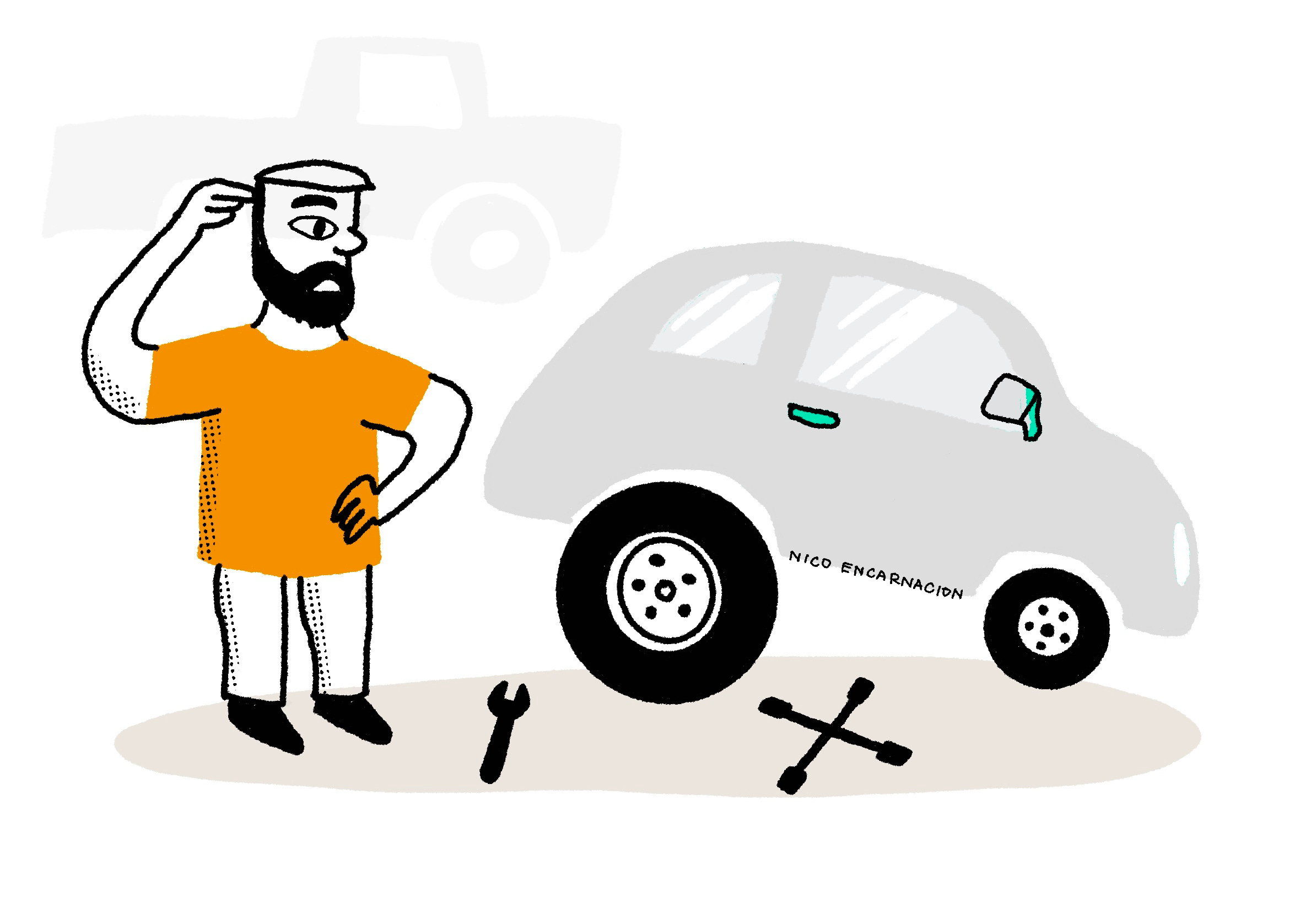
Why repeating design patterns isn’t always the answer
Sometimes, reusing a wheel just doesn’t work, especially if it’s the wrong one.

I once read that you don’t always have to be super innovative to be a designer. You just need to know how to reuse design patterns that work well. In some cases, that’s true. Why reinvent the wheel when you can just reuse it, right? But most of the time, reusing a wheel isn’t enough…especially if it’s the wrong kind of wheel.
We’ve all been there. We’ve designed something that worked really well and we’re just tempted to reuse that design for similar problems elsewhere. However, we sometimes forget that every new project is unique, with its own user behavior, business needs, success metrics, and even backend constraints (more on those later).
Instead of just copying old solutions, we should first understand what made them successful in the first place and really dig into what the current problem is. Marina Krutchinsky nails this in her article about the Past Success Trap:
Your past successes can become your future failures if you let them calcify into unchangeable “truths.”
Successful design patterns shouldn’t be your go-to solution every time you face a similar problem. Trust me, I’ve learned that lesson the hard way…
When a winning fix didn’t work… twice
A year ago, I worked on “platform A” where users complained about a side panel (drawer) being too narrow. My team added a resizing feature, and it was a hit. Fast forward a few months, I’m working with another designer on “platform B” with two similar issues:
A note-taking side panel that users found was, surprise surprise, too narrow. They wanted to adjust the size depending on where they were on their workflow (e.g. When taking down notes, they needed it bigger. When working on a case, they needed it smaller).
A bottom panel that had a very clunky expand/collapse interaction
Naturally, I thought, “I know exactly how to fix this!” and suggested the same resizing solution. I showed a demo to the team, we copied the design and implemented it. If it worked before, why wouldn’t it work again?
It didn’t. 🫣
We dug into what went wrong and discovered that users were spending way too much time adjusting the panel size. This ended up hurting the time-on-task metric, which was the primary KPI for platform B. As a result, the team had to shut down the experiment and go back to the original design. This happened because I blindly recommended an old solution without really considering platform B’s unique context and goals.
Understanding the problem before selecting a pattern
NN/g has a huge collection of specific guidelines on designing a variety of interface patterns. The articles are very comprehensive and I’ve referred to a lot of these for both agency and in-house projects in the past. However, choosing the right pattern for your project is not just about picking the most popular one from a list, implementing it, and calling it a day. You need to consider your users’ needs, context, and goals, as well as the business objectives and any limitations you’re working with.
Here’s a list of questions I ask myself before picking the best design pattern, along with some examples from my experience:
1. What are the users’ specific needs and goals? 🏆
Every project has its own audience with different goals, behaviors, and pain points. A pattern that works for one group might not be the best fit for another.
Example: Organizing emails into folders or tabs works well for regular users. But for customer service agents dealing with high volumes of emails, it’s important to quickly spot which ones need immediate attention.
2. What is the environment in which users interact with your design? 🖥️
The environment and conditions where users interact with your design can be quite different. Patterns that work well on mobile apps might not translate as smoothly to desktop interfaces and vice versa.
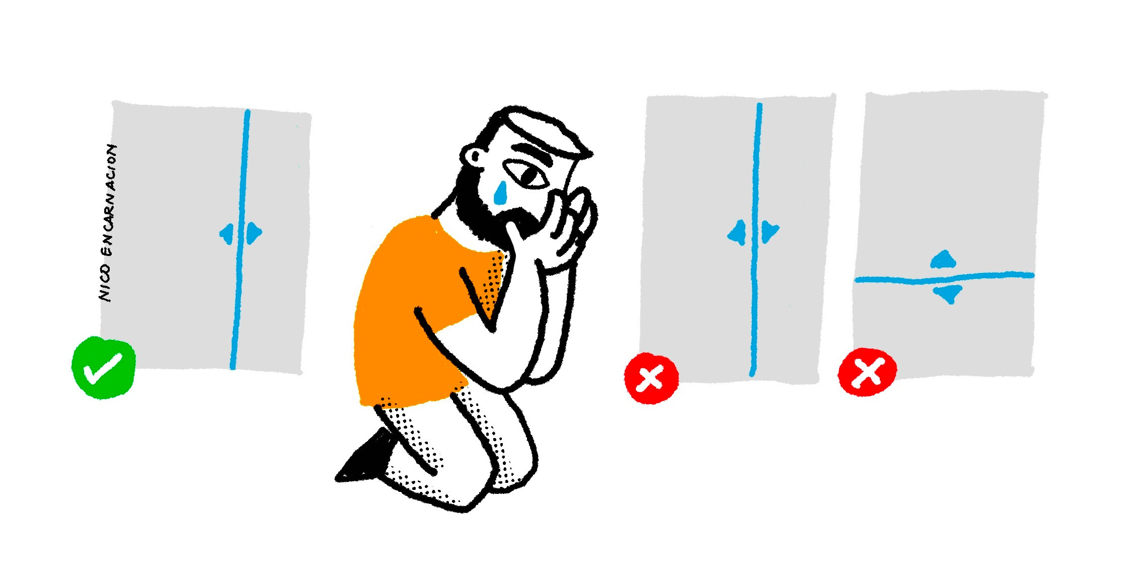
Example: In a previous project, we found that using tabs to organize sections for different functions and information frustrated users who primarily used large monitors* when handling high-volume traffic. Showing multiple sections side by side worked much better for efficiency.
*All users were issued the same large monitors by the company for this specific use.
3. How will a design pattern affect success metrics? 📈
Every project has its own success metrics. A design pattern made for flexibility in a consumer-facing app might not match the goals of an enterprise tool that’s all about efficiency.
Example: As I mentioned in my story earlier, a drag-to-resize pattern that lets users adjust section sizes over and over may not be ideal for platforms where task efficiency is a priority. Instead, providing buttons to quickly set sections to fixed widths might be better.
4. Are there technical or resource constraints limiting your choices? 🚧
Technical capabilities and limitations can differ based on the platform or device. Patterns that depend on real-time data updates might not work well on systems with limited resources.
Example: Standard sorting and filtering might seem like easy features to use in data tables, but they can be a challenge for legacy systems with outdated APIs. (I’ve run into this issue more times than I can count. 🥲)
5. How will a design pattern scale to accommodate complex data? 🧩
Some patterns might work great for smaller projects but can struggle when things get bigger or more complicated. Make sure the pattern can adapt as the project scales.
Example: Card-based layouts are great for small dashboards because they make it easy to display small sets of data. But for larger datasets, like monitoring high-volume communication traffic, table views with filtering and sorting options are usually more scalable and preferred by users.
6. How will a design pattern scale for complex workflows? 🧩
Some projects involve repetitive, low-complexity tasks, while others focus on occasional, high-complexity workflows. A pattern made for quick interactions might annoy users who need to handle more detailed or rare tasks.
Example: Hiding advanced filters behind an extra click is common in consumer-facing products. But on complex platforms where users filter information often, removing that extra click makes things more accessible and helps reduce frustration.
7. How does the target audience’s culture shape their expectations? 🌏
User expectations and preferences can differ based on cultural norms or regional standards. A pattern that works well for Western audiences might not be as effective for users in Asia or the Middle East.
Example: In shopping apps, Western users usually prefer clean, minimalist designs with clear navigation and subtle promotions for a smooth shopping experience. On the other hand, Asian users tend to like more visually rich layouts, with promotions and time-sensitive offers that create a sense of urgency and engagement.
The takeaway
Just because a solution worked once doesn’t mean it’ll work everywhere. Different products have different users and success criteria. So, the next time you’re tempted to dust off an old solution and call it a day, take a step back. Dig into the problem. Look at the user behavior patterns that might totally contradict your previous assumptions. And if you’re going to repeat a pattern, make sure it’s for the right reasons, not just because it worked last time. We all know how “one size fits all” usually ends up. 😉
Thanks for reading!
Subscribe for free to receive more stories about the everyday moments and lessons of being a product designer.